Problem & Opportunity
Why users struggled to understand services and take action
The Problem
Key Insights
Users struggled to understand available services
Unclear structure caused confusion and drop-off
Unclear Service Organization
Services weren’t clearly organized
Too Many Competing Options
No prioritization led to confusion
Lack of Guidance
No clear path to take action
Opportunity
Create a clearer path.
Guide users to the right service with a clear, simplified structure
Reduce friction early in the experience
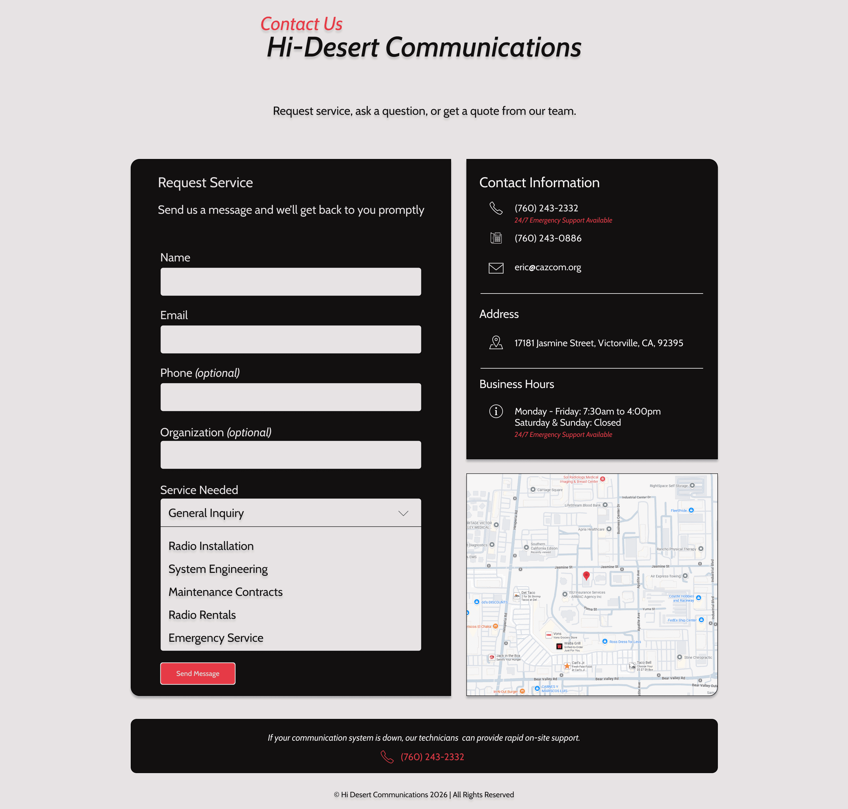
Early Wireframes


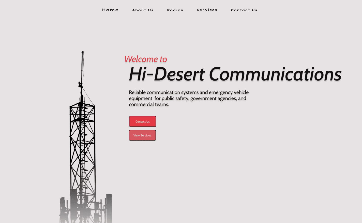
Existing Homepage
Solution
How the experience was redesigned to simplify service
discovery and reduce friction
Core Design Decisions
Clear Service Entry Point
Primary CTA guides users to the right service
Organized Service Structure
Grouped services simplify decisions and scanning
Guided Service Flow
Clear steps lead users from browsing to contact
Clear Service Entry Point
Organized Service Structure
Focused on clarity and ease of use
Simplified structure and clear next steps increased engagement and reduced drop-off
Key Designs
Final interface focused on clarity, speed, and guided
decision-making
Core Design Decisions
Clear Service Entry
Clear entry points reduce search time
Organized Service Structure
Structured paths guide users to contact faster
Results & Impact
Prioritized clarity and fast access to drive
more inquiries


Simplified structure reduced confusion
Faster scanning of services
Clear path from discovery to contact
Improved confidence in decision-making
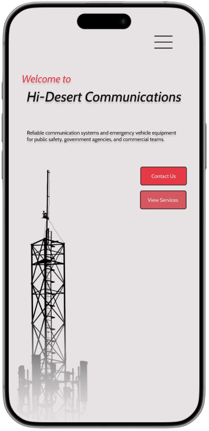
Strong mobile hierarchy and actions
Validation & Impact
How I tested the solution and what improved.
Validation Results
Conducted lightweight usability testing to evaluate service clarity and navigation
Faster identification of relevant services
Less hesitation when deciding how to proceed
More intuitive and scannable navigation
Key Learnings
Clear structure improves decision-making
Users responded better when services were grouped and easy to scan
Too many options create friction
Reducing early complexity improved speed and
confidence
Guided paths increase action
Clear next steps helped users move from browsing
to contact
Designed for clarity, confidence, and faster inquiries
Simplifying structure and reducing friction helped users take action more quickly
Reflection & Next Steps
What I learned and how I’d improve the experience.
What I Learned
Clear direction outperforms too many choices
Structured flows reduce hesitation
Simplicity leads to faster decisions
What I’d Improve
Add clearer service comparisons
Simplify content for non-technical users
Test with a larger user group
If I Had More Time
A/B test entry points
Validate follow-up actions
Refine microinteractions
Clarity early in the journey drives stronger completion and momentum
Problem & Opportunity
Why users struggled to understand services and take action
The Problem
Key Insights
Unclear Service Organization
Services weren’t clearly organized
Too Many Competing Options
No prioritization led to confusion
Lack of Guidance
No clear path to take action
Opportunity
Create a clearer path.
Guide users to the right service with a clear, simplified structure
Reduce friction early in the experience
Early Wireframes
Existing Homepage
Users struggled to understand available services
Unclear structure caused confusion and drop-off
Solution
How the experience was redesigned to simplify service
discovery and reduce friction
Core Design Decisions
Clear Service Entry Point
Primary CTA guides users to the right service
Organized Service Structure
Grouped services simplify decisions and scanning
Guided Service Flow
Clear steps lead users from browsing to contact
Clear Service Entry Point
Organized Service Structure
Focused on clarity and ease of use
Simplified structure and clear next steps increased engagement and reduced drop-off
Key Designs
Final interface focused on clarity, speed, and guided
decision-making
Core Design Decisions
Clear Service Entry
Clear entry points reduce search time
Organized Service Structure
Structured paths guide users to contact faster
Results & Impact
Prioritized clarity and fast access to drive
more inquiries
Simplified structure reduced confusion
Faster scanning of services
Clear path from discovery to contact
Improved confidence in decision-making
Strong mobile hierarchy and actions
Validation & Impact
How I tested the solution and what improved.
Validation Results
Conducted lightweight usability testing to evaluate service clarity and navigation
Faster identification of relevant services
Less hesitation when deciding how to proceed
More intuitive and scannable navigation
Key Learnings
Clear structure improves decision-making
Users responded better when services were grouped and easy to scan
Too many options create friction
Reducing early complexity improved speed and
confidence
Guided paths increase action
Clear next steps helped users move from browsing
to contact
Designed for clarity, confidence, and faster inquiries
Simplifying structure and reducing friction helped users take action more quickly
Reflection & Next Steps
What I learned and how I’d improve the experience.
What I Learned
Clear direction outperforms too many choices
Structured flows reduce hesitation
Simplicity leads to faster decisions
What I’d Improve
Add clearer service comparisons
Simplify content for non-technical users
Test with a larger user group
If I Had More Time
A/B test entry points
Validate follow-up actions
Refine micro-interactions
Clarity early in the journey drives stronger completion and momentum

Role
UX/UI Designer
Tools Used
Figma, Framer
Timeline
5 weeks
Redesigning a service website to improve clarity and increase inquiries
Concept redesign pitched to the business to explore real-world implementation
PRODUCT DESIGN CASE STUDY
Hi-Desert Communications
Users struggled to understand services and what to do next.
Unclear structure led to confusion and inaction.
Goal:
Guide users to the right solution through clear, simple pathways.
At a Glance
Problem: Unclear services and navigation
Solution: Simplified, structured experience
Focus: Reduce confusion and guide decisions
Outcome: Faster understanding & more inquiries
PRODUCT DESIGN CASE STUDY
Hi-Desert Communications
Redesigning a public safety communications website to reduce friction and improve customer inquiries
Independent redesign concept based on a real business, pitched to explore potential usability improvements
Role
UX/UI Designer
Timeline
March 2026 - April 2026 (5 weeks)
Tools
Figma, Framer
Users struggled to understand available services and what to do next
Goal: Guide users to the right solution quickly through clearer structure, simplified language, and intuitive pathways.
Unclear services and navigation made it difficult for users to identify the right solution
Problem
Solution
Focus
Outcome
Restructured the experience with simplified service categories and clearer entry points
Reduce cognitive load and guide users through scannable, decision-friendly pathways
Users were able to identify relevant services faster and move toward action with more confidence
At a Glance


The existing website lacked clear structure and relied on internal terminology, making it difficult for users to quickly identify the right solution or take action.
Problem & Opportunity
Reducing Decision Friction in the Booking Flow
The Problem
Key Insights
Users encountered friction early in the decision process due to unclear service groupings, technical language, and lack of guided navigation.
Why users struggled to understand services and take action
Early Redesign Wireframe
Create a clearer, more structured experience that helps users quickly understand services and confidently take the next step
Unclear Service Structure
Services were not clearly grouped, making it difficult to understand available offerings
Overly Technical Language
Industry terminology created confusion for users unfamiliar with radio systems
Guided Pathways Missing
Users weren’t guided toward key actions, leading to hesitation and drop-off
Why It Matters
Missed opportunities: Users couldn’t quickly determine fit
Technical content lacked clear structure
Services weren’t meaningfully grouped
No clear starting point
Based on a review of the current site’s navigation, service pages, and content structure.
Decision fatigue: Unclear content slowed decisions and increased drop-off

1
2
3
The Opportunity
Guide users to the right solution with clear structure and intuitive pathways
Existing Homepage
Solution
Reducing Decision Friction in the Booking Flow
Core Design Decisions
I redesigned the experience to prioritize clarity over complexity, restructuring how services are presented and introducing clearer pathways to help users quickly identify the right solution.
Clear Service Entry Point
Reduced reliance on internal terminology in favor of plain, user-focused language
Simplified service hierarchy
Grouped services into clearer, user-friendly categories to reduce confusion and improve scannability
1
2
Prioritized clarity over technical depth
Introduced guided entry points
Added structured pathways to help users quickly navigate to relevant solutions
Organized Service Structure

Key Designs
Breaking down the decisions behind a clearer, more actionable service experience
Designed to improve service discovery, reduce confusion, and guide users to contact with confidence
Introduced clear service entry points to guide users toward relevant solutions quickly
Structured pathways to guide users from discovery to contact without friction
Results & Impact
Mobile View
Prioritized clarity and fast access to services to drive more inquiries
Clear Service Entry Point
Organized Service Structure
Reduced confusion by simplifying service structure and terminology
Improved scannability, helping users quickly identify relevant services
Created clear pathways that guide users from discovery to contact
Increased confidence in decision-making through structured content
Maintained clear hierarchy and primary actions across mobile for quick access
Validation & Impact
Reducing Decision Friction in the Booking Flow
Validated Service Entry Experience
How the redesign improved clarity, usability, and service discovery
Designed a clearer, more intuitive experience that supports faster decision-making and more confident user action
Impact
Key Improvements
Clearer structure reduced early decision friction
Simplified language made services easier to understand
Guided pathways helped users move toward action faster
Validation Results
Users were able to identify relevant services more quickly during testing
Reduced hesitation when navigating between service categories
Improved confidence in selecting the right solution
Reflection & Next Steps
Reducing Decision Friction in the Booking Flow
What I Learned
Simplifying service structure has the biggest impact on user decision-making
Clear, guided pathways outperform flexible but ambiguous navigation
Reducing technical language improves comprehension for non-expert users
Strong hierarchy and content organization directly influence trust and confidence
What I’d Improve
Introduce clearer service comparison to support users unsure of what they need
Add real-world examples and use cases to strengthen decision confidence
Test alternative CTA placements to improve conversion behavior
Further refine hierarchy across deeper pages for consistency at scale
If I Had More Time
Conduct broader usability testing with business owners and non-technical users
Validate impact on inquiry rates and user conversion behavior
Explore SEO and content strategy to improve service discoverability
Continue iterating on mobile layouts for real-world usage scenarios
What I learned and how I would improve the experience further
This project reinforced that clear structure, simplified language, and guided navigation are critical for reducing friction, improving decision-making, and driving meaningful user action.